Branding and Transforming Your Beer Into Art
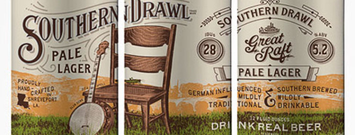
While we all hope that our beer is good enough to sell itself, there’s a ton of great beer out there. If no one every tries your beer for the first time, no one will know how great it is. This is where branding, labeling and packaging can have a huge impact on making your beer stand out from the rest.
For someone who is not familiar with your brewery, picture your new potential fan standing in the craft beer aisle of the liquor store scanning for a beer to try. Say there’s 250 different types of beer in the aisle and the person spends three minutes looking around. This gives 3/4 of a second to spend looking at each beer assuming they look at every beer for the same amount of time. Realistically, the person is going to have a few beers that catch their eye and they’ll spend most of their time checking those out in more detail. So if you put your beer next to 250 others, does it have that eye catching ability to make people stop and spend more than a second looking at it?
When I was looking for examples of great beer labels to feature, I stumbled across the “Oh Beautiful Beer” blog by Harvey Shepard. In the blog, Harvey has put together an amazing collection of bottle, can, 6-pack and brewery logo designs that inspire creativity. He has discovered art in beer form and really shows what an eye-catching design looks like. Harvey also does graphic design so if you need some outside help to transform your beer or brewery logo into art, you can can get in contact with him at harveyshepard.com. I wanted to pick his brain about what really makes up a good design and how much of an impact it has to the small brewer.
Some Q&A on What Really Makes a Great Beer Design
What is a common theme that you see in the “beautiful beer” that you put up on your site?
It’s hard to generalize, but some of the most effective beer labels are clean and clear. I think a lot of labels fall flat because they are too complicated. A beer label is a fairly small medium to work with. A lineup of labels with complex illustrations or a lot of small detail can appear muddy on the shelf.
What’s your favorite logo or beer design that you’ve found and why did you like it so much?
I hate to play favorites, but I am completely in love with McGarrah Jessee’s work for Shiner. It is a perfect example of a brand creating an image. The photos, copy and design elements all have the look and feel of a working class beer from a century-old brewery in a tiny Texas town. Their print ads are unique, clever and further drive home their brand with slogans like “Made in Shiner by people made in Shiner,” and “Not new. Not improved.”
As far as consistency goes, their packaging is a bit looser than most, but it works. Each six pack is immediately identifiable and every new release looks fresh and exciting, rather than formulaic.
When you’re looking to develop a logo or beer bottle design for a brewing client, what questions do you usually ask them to get a feel for what to design for them? Said another way, if a brewer was trying to figure out how to design their own label, how do they go figuring out the identity of their brewery and how to portray that in their branding?
I’m always a fan of the story. I want to hear about how the company came to be and where the brand name came from. It doesn’t work for everyone, but there are some fine examples of brewers successfully using imagery from their professional or personal history.
The bicycle in the New Belgium logo roots in founder Jeff Lebesch’s vacation spent biking to various Belgian breweries. The homebrewer returned to Colorado inspired and created the recipe for Fat Tire Amber Ale and eventually a brewery.
When Pretty Things founders Dann and Martha Paquette were first dating, Dann was drawn to a framed piece of embroidery Martha’s grandmother made. He immediately decided that the white tree on a red shield would become the logo for their future brewery.
Every client is different but some questions to consider are: What story do you have to tell? What sets your company apart from your competition? What feeling or message do you want your branding to convey to those who view it?
What aspects do you think are important when considering overall branding for a small brewery?
Visual consistency across the brand is certainly important. Whether it’s a beer bottle, print ad or coaster, each piece helps reinforce the overall identity. But it’s also very important that you know that your brand is much more than just the visual elements. It’s every way you interact with your audience. It’s every tweet you send and every conversation your staff has with a customer.
How much do you consider tailoring your branding to the potential demographics of the customers (if at all)?
Knowing your target audience is certainly an important part of the design process. If you want to sell your product, you need to know who is going to buy it and how to reach them.
How big of an influence do you think that branding has on overall beer sales?
For better or worse, packaging plays an important role in products we buy and beer is no exception. With more than 15,000 breweries worldwide, each needs to separate themselves from the crowd in any and every way possible. Design is a very effective means to do just that. More often than not, a beer label is the first way a consumer interacts with the brand.
There are plenty of stores with enormous amounts of shelf space dedicated to beer. If I’m staring at seemingly thousands of beers on a shelf, I’m not likely to pick up a beer I’ve never tried unless the packaging piques my interest. Of course, I’m not going to continue buying that beer unless I’m happy with the contents, but the packaging gets the foot in the door. The brand with the unprofessional design is going to stay on the shelf, no matter how good the product might be.
Join the Community
Next week, I’ll be putting out a step-by-step guide on how to work through the financials for your brewery’s business plan. To get updates on when this and other content comes out, make sure to connect with me by clicking the button below. As my thank you for joining the community, I’ll send you the 6 Free Social Media Tools To Get People Talking About Your Beer e-book for free.


Some good points for breweries to consider. I am a fan of clean and
clear brands as well. It shows a refinement that can get lost in
cluttered designs.
ps – Great picture Harvey!